
ABOUT THE
PROJECT
OVERVIEW
FORTE is the Netflix of fitness, where people can stream on demand or live workouts from top boutique gyms around the country.
People currently using FORTE are active women between the ages of 25-50 that often lack the time or resources to get to the gym.
This was a real-world client for a platform that still currently in beta.
THE CHALLENGE
FORTE wanted to increase conversions by validating the needs of potential users, along with increasing user engagement among current users through exploratory research.
They expressed interest in pursuing wearable integration, a tv app and redesigning their mobile app. All of which were secondary to their core product — the website, which is still in beta and current houses all of the streaming and on demand content.
MY ROLE
My primary role was leading User Research, recruiting for and conducting interviews and generating insights. I played a supporting role in product strategy, concept development and design.
PROJECT TIMELINE

COMPARATIVE
RESEARCH
Similar companies had landing pages to communicate value and features like saving videos and class schedules to increase engagement
Before our kickoff meeting with Stakeholders we performed a comparative analysis to understand how other companies market themselves and what features they provide to users. This would help to understand the gaps in what FORTE currently offers, and provide a starting point for our user research.
We decided on Peloton, Daily Burn and Class Pass because they each had a strong presence and offered streaming fitness classes, whether live, on demand or both.
Peloton offers live and on demand spin classes from their in house trainers. Daily Burn has structured on demand fitness programs and Class Pass offers all access membership to 10,000 gyms across the world.

LANDING PAGE
These companies all had a landing page to entice potential customers to sign up for their platform. With several calls to action across each page, brand pillars, quotes from satisfied customers and links to press mentions.

EVALUATING
THE WEBSITE
Heuristic analysis show that FORTE could have issues communicating to potential users what they offer, which could lower the rate of conversion.
Comparative research showed that FORTE could need at least a landing page to convert new users. We wanted to talk to FORTE users to see if features like reviews and saving a class that other companies offered would be valuable to them. In our kickoff meeting stakeholders agreed to provide us with a contact list of FORTE users, but they eventually took three days deliver it.
Since we had a short timeline we couldn’t just sit and wait for a contact list. To get some actionable insights while waiting, we performed a heuristic analysis of the current website, and a usablity test the site with people who’ve never used FORTE.
Information should be presented in a clear and transparent way
Brand pillars on the homepage contain the only information about what FORTE offers, and with its long copy, small text and vague messaging, it’s unlikely that most potential customers would read them.

Contextually relevant information and features should be easily discoverable
If a user wants to search for a class by class type, difficulty, duration, etc., there is a filter that they can use after clicking on the search bar. As they add more content to the site this is a great feature to have so users can quickly find content that fits their interests.
In its current form however, there are too many filters and options clustered in a small space making it overwhelming for users to select relevant filters for their search.

INITIAL USABILITY
TESTING
Testing showed that people had difficultly filtering classes and understanding what FORTE offers.
We selected five participants based on the findings of Nielsen-Norman Group, which found that five participants testing a design could determine 85% of the usability issues.
To assess the usability of the site, we asked the participants to think aloud as we guided them through the following scenarios:
Browsing through the Home and About pages
Are they able to quickly understand what FORTE offers?
Searching for a specific class
Was using the search filter to find a class a seamless and intuitive experience?
Choosing a class and watching a workout
Are there gaps in the flow of finding and taking a class? What information is relevant when someone is deciding on a class to take?
Homepage
Two of the five didn't understand the site
“When you land there’s nothing that tells you what this site does”
Nathan, 23
Reviews
People want to see reviews when deciding on a class
“Reviews are important. People would probably talk about it they like the pace or the instructor.”
Jessamyn, 27
Filter
4 of 5 people had trouble finding and using filters
"There's so many options, I feel overwhelmed"
Dana, 26
USER
INTERVIEWS
FORTE users want to see reviews and save videos. Potential customers need to understand the convenience of working out from home.
As I was in charge of leading user research for this project, I went about recruiting and conducting interviews with FORTE users.
While I was in the process of this, our team realized that there was value in getting the perspective of people that do not currently use FORTE. These potential users could give a fresh perspective on the needs of a new user and what was necessary to entice them to use the platform.
FORTE Users
The five participants we spoke with were all women between the ages of 27 and 36, which is the demographic that comprises the majority of the user base.
Reviews
Three wanted to see class reviews
“I couldn't figure out which class to take because there wasn't any reviews.”
Brittany, 32
Live Classes
Two users couldn't find Live classes
“I’ve never watched a live class. I was interested in trying one but I couldn’t find it.”
Alex, 27
Wearables
No one owned a wearable or saw a benefit to using them
“I don't use any wearables. I don't know that using them would change my behavior at all.”
Jessica, 28
Non Users
For this group we targeted people that exercised regularly, or had done so in the past. We wanted to understand people's motivations for working out to see if there were features not present in the current iteration of FORTE that could be added to draw people to the platform.
Motivations
Saw working out as a means to and end
“...superficial side, you want to look good. It's important to prepare the body for aging.”
Lejandro, 26
Competition
Competing against others doesn't motivate them
“Competitive in business, but not when I'm trying to workout.”
Rob, 23
Wearables
Using a wearable device didn't always help reach their goals
“When I was tracking myself I was working out less and eating more unhealthy foods.”
Stacy, 24
Affinity
Mapping
We used Affinity Mapping to synthesize all of the raw data from these interviews.
Quotes and insights we gathered from interviews were grouped together and titled with a theme to describe each group. These themes would be used to inform the personas — representations of the user groups based on our research.

Insights from our FORTE users. Another affinity map was created for non-users.
PERSONAS
Insights from Affinity Mapping led to the creation of both current and new FORTE users.

ADA - FORTE USER
Identifying painpoints in Ada's current experience with FORTE will help uncover opportunities for improvement

JUDI - NEW USER
Our new user Judi needs to be persuaded that FORTE is right for her needs.
PRIORITIZING FEATURES
We prioritized a landing page to increase engagement and separating class content, refining the filter and saving videos to increase engagement.
To sort the features into essential and non-essential needs of Judi and Ada we used a feature prioritization chart. Features that were placed in the quadrant that were low cost and essential were prioritized over features places in the quadrant high cost and nice to have.

Increasing User Engagement
Word of mouth is one of the strongest assets in developing a successful brand. Because the site was still in beta, there is large pool of early adopters that could become brand advocates — people willing to champion the brand and persuade others to join.
The best way to turn people like Ada into brand advocates is to highlight FORTE’s unique features and streamline the process of finding the content that fits their interests.
Separating Class Types
Where are live classes?
Ada needs to have live and on demand content separated to find live content
Simplifying the filter
The 'Netflix effect'
Ada has trouble finding a class and needs to quickly access relevant filters to find a class
Saving Classes
Where are my 'go to' videos?
Ada needs to be able to save a class so that she can quickly jump into a workout
Workout Reviews
Is this class for me?
Ada wants to know if a class fits her needs and wants to see others opinions to decide
Increasing Conversions
Potential users like Judi need to bridge the gap between awareness of FORTE and signing up for the service. The value of the service needs to be clearly communicated, with a frictionless signup process.
Landing Page
Is this worth my money?
Judi needs to see copy and visuals that demonstrate value
Signup and Checkout
Just get me to the workouts
Judi needs the process to be streamlined and painless
Concept
Development
Four days were left till our deadline, and we still had to create and practice a presentation. We had to move fast to work design all of the essential features we prioritized.
I ran design studio sessions for each of the features where the team sketched out concepts which were then finalized into low fidelity wireframes. We then jumped straight to high-fidelity and tested them using a scenario that took participants from the landing page to sign up and finally watching a video.
Landing Page
Keeping Judi, our new user in mind, we made sure that there was enough information and visual cues that would help her decide if FORTE was right for her.

On Demand Page
Ada, our FORTE user, had trouble finding live content. The best way to clearly differentiate live from on demand classes was to separate the content onto different pages.
In a perfect world...
With a longer deadline we would have wireframed these concepts and validated with users before moving to high-fidelity.

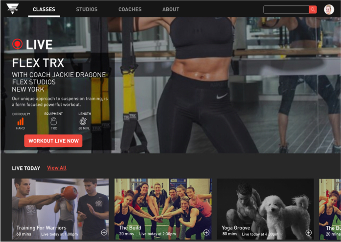
Live Classes Page
The Live Classes page prominently features classes that are currently taking place, along with live classes scheduled for the day or during the week below.

Users can save upcoming live classes to their schedule and receive a notification by clicking the plus icon.
Reviews
Stakeholders were concerned that negative reviews would cause trainers to abandon the platform, but our persona Ada wanted a way to quickly understand if the class was a good fit for her. To accommodate the needs of both the stakeholders and user like Ada I created a badge system.
Replacing the quantitative star rating system and comment section with a qualitative rating system is only tied to the specific workout and not the trainer which also give context to the rating.
After a user completes a workout video they are prompted to choose from a several badges that succinctly describe the workout and how it made them feel. The top three badges from all users that complete the workout will be displayed on the video page.

Checkout
As the site was still in beta, a process for signing up had not been established. I created a checkout flow to think through the steps involved in registering Judi, a new user, from selecting a free trial on the landing page to completing registration.


Search Filter
FORTE users like Ada found it difficult to filter classes. There was just too many options being presented at once, which overwhelmed people.
To solve for this I redesigned the filter by putting filter terms into accordions. When a user wants to filter results they can now click that filter and reveal its options, without being bombarded with information
ORIGINAL

PURPOSED

OUTCOMES
Elements of our work on the Landing Page were incorporated, such as images showing context of use and more concise copy, but the majority of the features have not been implemented at this time.
This project was challenging because of the short timeframe in which to complete the work. Our team, myself included, was overly concerned with having interviews with FORTE users, which delayed us moving forward for a few precious days. We were worried that not having enough feedback from users would affect the quality of our output.
Overall, I enjoyed this project and how challenging it was. It was exciting to be working with my first ‘real-world’ client, and I’m proud of the work that my team and I accomplished in such a short timeframe.